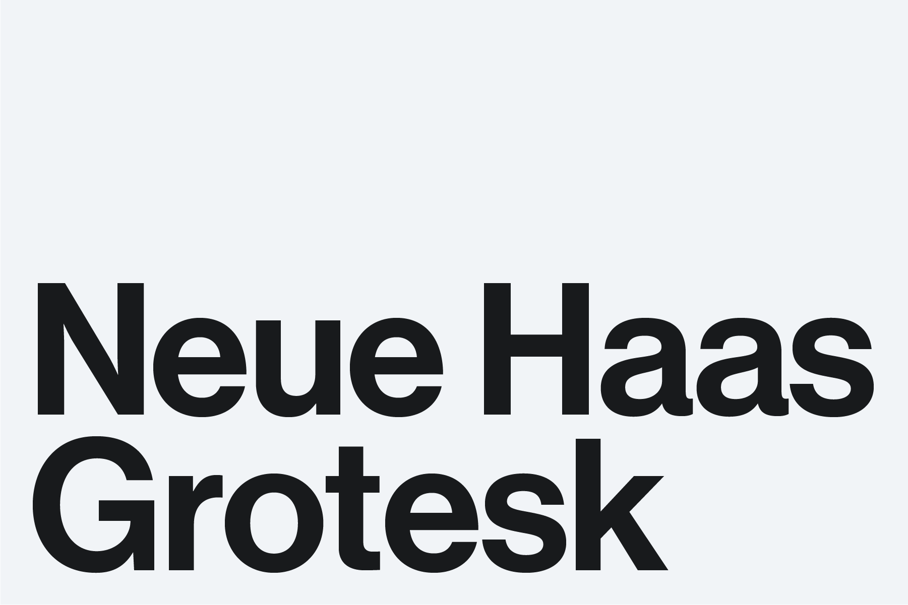
Our typography is bold and clean, expressing the impact of our School and the leading institution we are. It is modern yet retains the gravitas that sets us apart. Neue Haas Grotesk is at the heart of our brand. Distinctive and eminently legible, it is available in a variety of weights that express both contemporary and timeless qualities.
Introduction
Neue Haas Grotesk (abbreviated NHG) was designed with a size conscious approach, optimizing the spacing, proportions, weight, and other details for best results depending on the size of the text. The typeface comes in two optical size families – one for large sizes (called display) and one for small ones (called text).
Available Weights
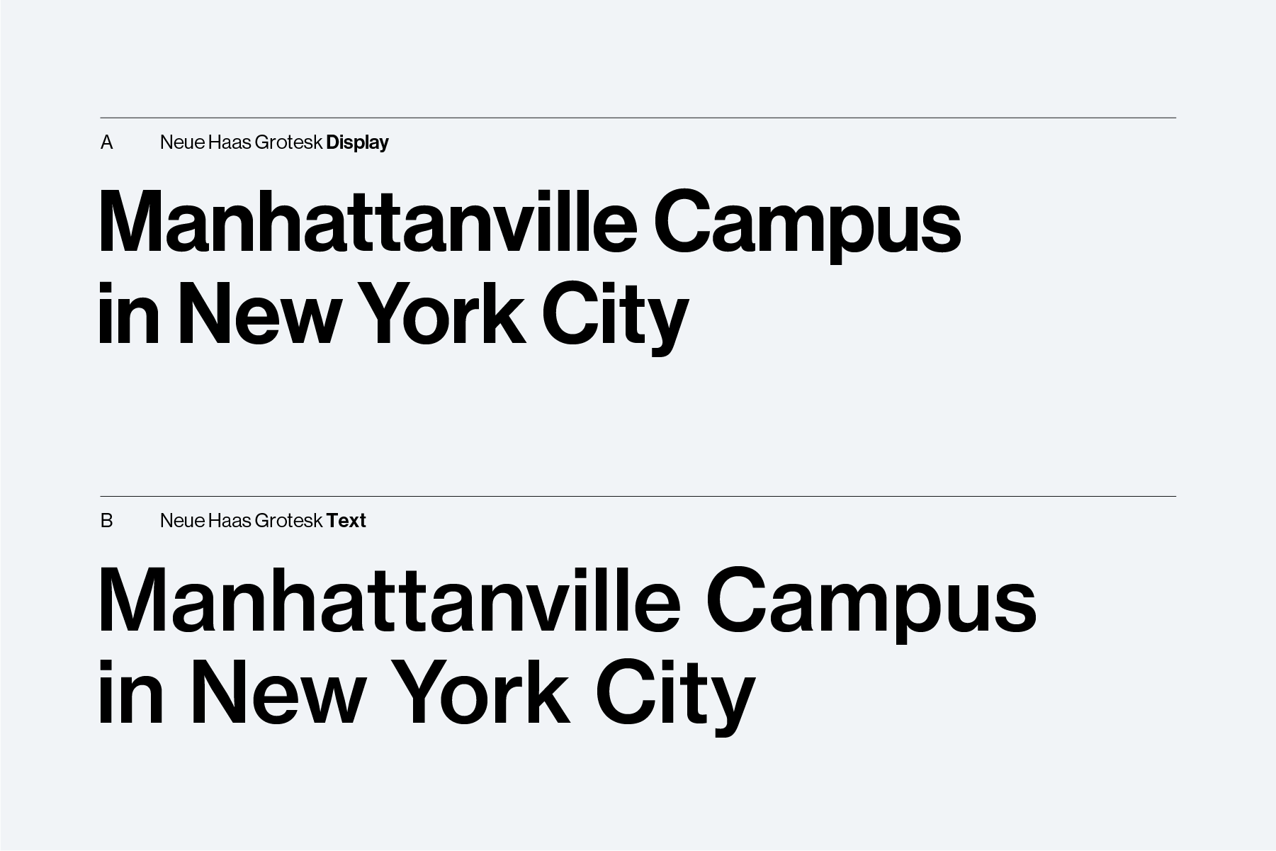
NHG comes in two optical styles: display and text.
- The display style has smaller spacing between each letterform (called glyphs) and aesthetic niceties on some of the glyphs that would otherwise be lost in small sizes. In contrast, the text style has more open spacing between each glyph, and many of the glyphs have a more streamlined design.
- The text style has been designed for small sizing and should be used for such.
Further down this page is a chart with recommended sizes; the general rule is that the display style should be used above 24 points/pixels and the text size should be used for 23 points/pixels and below.
Preferred Weights
The full NHG family of options is large, but we at the School only use ten weights in our branding:
Neue Haas Grotesk Display
Available in:
- Medium
- Medium Italic
- Roman
- Roman Italic
Neue Haas Grotesk Text
Available in:
- Bold
- Bold Italic
- Medium
- Medium Italic
- Roman
- Roman Italic
For NHG Text, Bold and Bold Italic should only be used in body text if and only if the size difference created by Medium/Medium Italic is not sufficient for the content.
In Case You Were Wondering
Neue Haas Grotesk is German and roughly translates to "the New Haas Sans Serif". Haas is a reference to the type design studio (called a foundry) that made it, while sans serif is the font's visual classification.
Dont’s
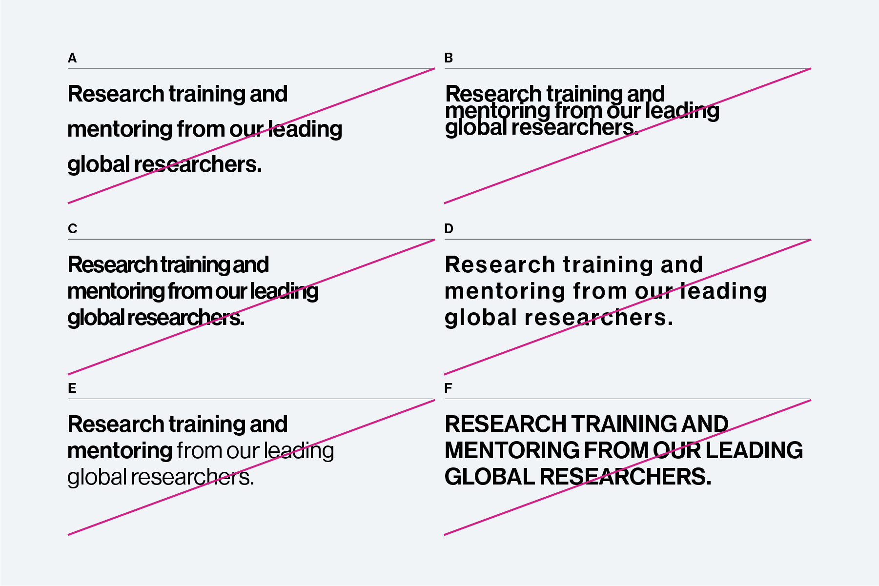
Do not:
- A. Use tall line-spacing (called leading)
- B. Use too tight leading. If the tails on low hanging letters like g and p begin to crash into tall letters like l and h, then your leading is too tight
- C. Overly reduce the letter-spacing (sometimes called tracking)
- D. Overly increase the letter-spacing
- E. Mix weights within a single headline. Note that it is ok to use medium and bold weights for emphasis in body text. If you need a portion of your headline to be different stylistically due to reasons of editorial style, consider using italics
- F. Do not set headlines in all caps. Exception: if your headline is entirely the name of a School program, such as MBA or MS, it is acceptable to use all caps.
Procurement and Alternatives
How to obtain Neue Haas Grotesk
NHG is not preloaded onto your computer. The two best ways to obtain the font is:
- Through Adobe Fonts: if you have a subscription to Adobe's Creative Cloud service, you have access to their extensive font library located at fonts.adobe.com. Adobe provides the full NHG family at no added cost, but it must be manually added to your library using their website.
- By purchasing: if you do not have access to an Adobe Creative Cloud subscription and do not wish to sign up, you can purchase the entire family through MyFonts.com. Please reach out to [email protected] before making the purchase. It is maximally important that you understand the licensing before making your purchase — creative licensing should be taken as seriously as academic licensing.
Alternatives
For some departments or teams, the cost of obtaining the NHG family may be out of reach. For others, the cost may not be justified given the scope of need.
The Strategic Communications team at the Business School recommends the below in the following order:
- Helvetica, including Helvetica Neue and Helvetica Now. Helvetica Neue comes pre-installed on all Apple computers.
- Inter. Inter is a free typeface that can be downloaded here. Note that while Inter is also available through Google Fonts, the files available there are not optimized for Microsoft Office.
- Arial. We emphatically do not recommend designing elaborate pieces using Arial. However, if you are in a situation where you need a branded piece and cannot use the Strategic Communications team's services, Arial is the final font in the acceptable alternatives list.