Bold, Confident: Hermes
The Columbia Business School is a confident and bold piece of artwork, anchored by the School’s beloved Hermes icon—a mark that has represented the School for over half a century. This logo and its related marks are the anchors for any and all visual media.
Logo Color
The logo comes in four approved colors: blue and black (“full color”), blue and white (“inverse”), black, and white.


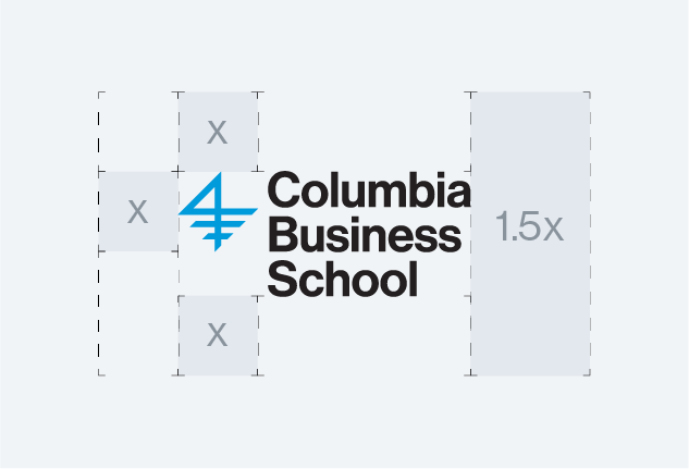
Clearance Area
The area around the logo should always provide ample space so that the logo is not crowded or constrained by the other elements nearby. The diagrams below show the correct amount of space required.
Maintain a distance of 1.5x on the right side of the logo to achieve true optical centering, meaning that the logo will appear centered to the eye.
Positioning
The logo should appear left-aligned or right-aligned along the top or bottom of the page or screen. Do not center the logo horizontally, unless it is absolutely necessary due to constraints.


Do Nots

Do not set the logo against a color that has poor contrast.

Do not set the logo against a color that makes it hard to read.

Do not edit the logo’s core attributes including its approved colors or layout.
Do not put the logo against a busy background that hurts readability.
Sub-brand Logos
The sub-brand logos are a customized mark that identifies an office or department within the School. Casually, many employees at the School refer to this mark as “their logo.” All best practices and guidelines on this page concerning the “Columbia Business School” logo apply to the sub-brands, as well.

Sub-brand Logo Guidelines
Multiple Sub-brands in One Area
Avoid placing multiple sub-brands next to one another. If you wish to give credit to multiple School centers and programs for something, aim to do so in running text.
The Marketing and Communications team has created a template as an option for those who would like multiple centers and programs to appear next to the center. Please note that this graphic is not a logo. Instead, it is an approved way of showcasing multiple CBS entities in a graphic way. This graphic cannot be reproduced on merchandise, used in the header of a web page, or in the header of an email.
Other Columbia logos
The Business School has many joint programs and initiatives with the other schools at Columbia University, and the Business School maintains a library of artwork containing most of the logos for schools that we partner with. Please email us if you have a need for any of these logos.
Columbia Business School employees should never use the Columbia University logo, or its associated marks, for any sole Business School program, event, or otherwise. Employees that are overseeing a University program or event should reach out to MarComms for guidance on best practices with respect to the University logo.
Design
The design of all things Columbia Business School reflects the institution’s leadership in the world of business and its ability to impact the world through any number of domains and disciplines.
Our visual design is anchored around three keywords:
- bold through our design’s stark and highly refined nature.
- rational through our design’s directness and confidence.
- and proud through the cleanliness of our layouts.
Colors
Columbia Business School’s signature turquoise blue is bright, cheerful, and eye-catching. The sometimes sporadic use of it in various contexts further enhances the energy surrounding it on the page or screen.
In addition to the brand blue, the School has an entire supporting color palette for various use cases.
The Primary Colors
The primary colors are the foundation for all design at the School. While their presence in some places may seem small, it was from them that the other color selections were made.
The Secondary Colors
The School has two secondary color palettes.
- A full palette of blues that are tints and shades of the School’s brand blue
- A palette of cool grays that when used well appear like silver on the page or screen
The Tertiary Colors
The tertiary palette is a selection of colors that should be used in select situations.
Excellent ways to use the tertiary colors:
- For data visualization, such as charts and graphs
- When blue and cool gray alone are not adequate to effectively communicate the information to the reader.
Typography
Our typography is bold and clean, expressing the impact of our School and the leading institution that we are. Our use of typography is modern and sustains the gravitas that sets us apart.
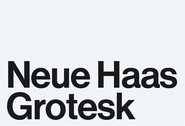
The font Neue Haas Grotesk is at the heart of our brand. Distinctive and eminently legible, it is available in two optical sizes intended for different use cases.
Different Versions for Different Needs
Neue Haas Grotesk comes in two optical variants. These variants are named Text and Display. Text should be used for body text, while Display should be used for headlines. The exception is that we do not recommend using Display for any type below 9 points.
Neue Haas Grotesque Display Example

Neue Haas Grotesk Text Example

Avoid the Following

Do not set headlines in all caps. Instead, use title case (or sentence case if appropriate).

Make sure that the line-spacing (a.k.a leading) does not create wide gaps between lines of text.
Backup Fonts
There are some instances where you may be unable to either get the brand typeface of the School, or where the platform you are using does not support custom typography.
In those instances, we recommend the below backup fonts in this order:
First backup: Helvetica. Note that Helvetica is readily available for use in Google Workspace and Canva. Those with Adobe accounts have access to Neue Haas Grotesk via fonts.adobe.com and should not use Helvetica if they have a full Adobe account.
Second backup: Inter. Like Neue Haas Grotesk, Inter comes in two optical variants that should be used following the same principle written above: headlines should be set in Display and body text should be set in Text.
Final backup: Arial. In some situations, no or very little options exist for custom typography. In those instances, use Arial, which is a web safe font and widely available.
Email Design
Email remains a highly constrained medium. When sending out mass email communications, we recommend using the Arial font, as support for custom typography is uneven. Note that this only applies to live text. Text used in graphics in email designs can be set to the brand typeface.
Body Copy in Letterhead
Since printed letters are often passed around to multiple individuals before being approved and delivered, we recommend setting the body text to Arial if you cannot guarantee control over the final output.
Promotional Products
Faculty members and staff can commission the production of a wide range of promotional products, such as apparel, accessories, and other various items.
Marketing and Communications, in collaboration with Campus Services’s Trademarks and Licensing office, provide guidance, policy, and approvals for any items produced.
Where to Procure
Promotional Products
Promotional products must be ordered and purchased through a vendor licensed by Columbia University. A current list of licensed vendors for use by Recognized Student Groups and Internal Organizations is available on the Exemplar Associates website. Please direct any questions to [email protected].
Printing
Columbia University faculty and staff can work with Columbia Printing for printing needs such as business cards, stationery, and marketing materials. Alternatively, faculty and staff can engage outside vendors. All University employees must follow the appropriate procurement process when onboarding and working with printing vendors other than Columbia Printing.
Design Guidelines for Promotional Products
Adding Text for the Purposes of Identification
Only the primary logos and sub-brands are recognized as official Columbia Business School logos. The School does not have a tertiary-level logo.
Groups that wish to identify a unit within a larger group may add additional text to their design. However, there must be space between the School logo and the text identifying the unit.
Choosing Color
When choosing an product’s color, MarComms has two broad guidelines:
- Adequate contrast: ensure that you select a color that provides good contrast between the graphic and the color of the fabric.
- Do not pick bad imitations of Columbia Business School blue: when you have the option to select a product with blue as the base color, do not select anything approximate to Columbia Business School blue. Remember the phrase: “close enough is not good enough”. If a vendor does not have a color that satisfactorily matches the School’s signature turquoise blue, we recommend selecting either navy blue or Columbia University light blue as these colors have well-established brand resonance.
Choosing the Correct Logo Version
Choose a version of the logo’s orientation that compliments the available space. Specifically on very narrow objects, such as pens and pencils, use the 1-line logo.